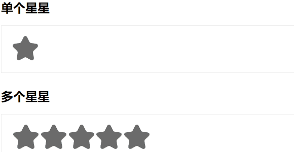
最近学习css的小尝试,用纯css实现了一个五星评分和一个点亮单颗星星的效果。
悬可以使得星星暂时高亮,点击能使得点击的那颗星星之前的星星一直高亮。
感谢铃兰帮忙修改耦合问题www
效果是这样的:
以下是代码部分
HTML:
<!DOCTYPE html><html><head><meta charset=”utf-8″><meta name=”viewport” content=”width=device-width, initial-scale=1″><title>星星评分</title><link type=”text/css” rel=”stylesheet” href=”star.css”/> <!– 引入外部css –><script>function tips0() {alert(‘选中了单颗星星’);}function tips1() {alert(‘5星好评’);}function tips2() {alert(‘4星不错’);}function tips3() {alert(‘3星中等’);}function tips4() {alert(‘2星一般’);}function tips5() {alert(‘1星差评’);}</script></head><body><h2>单个星星</h2><div class=”content”><div class=”rate-single”><input type=”radio” name=”star” id=”star0″ onclick=”tips0()”><label for=”star0″></label></div></div><h2>多个星星</h2><div class=”content”><div class=”rate-multi”><input type=”radio” name=”star” id=”star1″ onclick=”tips1()”><label for=”star1″></label><input type=”radio” name=”star” id=”star2″ onclick=”tips2()”><label for=”star2″></label><input type=”radio” name=”star” id=”star3″ onclick=”tips3()”><label for=”star3″></label><input type=”radio” name=”star” id=”star4″ onclick=”tips4()”><label for=”star4″></label><input type=”radio” name=”star” id=”star5″ onclick=”tips5()”><label for=”star5″></label></div></div></body></html>
css:
.content {margin-bottom: 30px;padding: 20px 30px;border: 1px solid #eee;text-align: right; /* 右对齐,因为后面要旋转180度这样就是左对齐的效果 */transform: rotateY(180deg); /* 旋转盒子180度(否则是从右往左点亮星星) */}/* TODO */.content input {display: none;/* 隐藏单选按钮 */}.content label {display: inline-block;/* 块级元素 */cursor: pointer;width: 50px;}.content label:before {position: relative;content: url(star-grey.svg);}.content label:after {position: absolute;width: 50px;padding: 0px;margin: 0px -50px;content: url(star.svg);opacity: 0;top: 0;transition: 0.2s;}.content label:hover:after,.content label:hover ~ label:after,.content input:checked ~ label:after{opacity: 1;/* 动画效果实现 */}.rate-single{transform: translateX(0);}.rate-multi{transform: translateX(0);}/* 因为旋转了180度所以如上这里挪位置 */
下面是所需的两个svg文件。
介绍:svg(Scalable Vector Graphics 可缩放矢量图形)是一种图形文件格式。基于xml(Extensible Markup Language 可扩展标记语言),由w3c(World Wide Web Consortium 万维网联盟)开发。
svg可用来设计非常棒棒且高分辨率的Web图形页面。简单点说,就是直接用代码来描绘图像,并且通过改变部分代码还能使图像具有交互功能。
代码如下:
star.svg
<svg id=”图层_1″ data-name=”图层 1″ xmlns=”http://www.w3.org/2000/svg” viewBox=”0 0 30 28.76″><defs><style>.cls-1{fill:#ffcc3b;}</style></defs><title>星星</title><path class=”cls-1″ d=”M24,1.93l2.82,5.71a2.34,2.34,0,0,0,1.77,1.28l6.3.92a2.35,2.35,0,0,1,1.3,4l-4.56,4.44a2.34,2.34,0,0,0-.68,2.08L32,26.63a2.35,2.35,0,0,1-3.4,2.48l-5.64-3a2.34,2.34,0,0,0-2.18,0l-5.64,3a2.35,2.35,0,0,1-3.4-2.48l1.07-6.27a2.36,2.36,0,0,0-.67-2.08L7.57,13.84a2.34,2.34,0,0,1,1.3-4l6.3-.92a2.37,2.37,0,0,0,1.77-1.28l2.81-5.71A2.34,2.34,0,0,1,24,1.93Z” transform=”translate(-6.86 -0.62)”/></svg>
star-grey.svg
<svg id=”图层_1″ data-name=”图层 1″ xmlns=”http://www.w3.org/2000/svg” viewBox=”0 0 30.04 28.81″><defs><style>.cls-1{fill:#6b6b6b;}</style></defs><title>星星-灰</title><path class=”cls-1″ d=”M17.14,1.31,20,7A2.34,2.34,0,0,0,21.73,8.3l6.3.92a2.36,2.36,0,0,1,2,2.67,2.4,2.4,0,0,1-.68,1.33l-4.56,4.44a2.34,2.34,0,0,0-.68,2.08L25.14,26a2.35,2.35,0,0,1-1.92,2.71,2.29,2.29,0,0,1-1.48-.23l-5.64-3a2.34,2.34,0,0,0-2.18,0l-5.64,3a2.35,2.35,0,0,1-3.17-1A2.38,2.38,0,0,1,4.88,26L6,19.74a2.36,2.36,0,0,0-.67-2.08L.71,13.22A2.35,2.35,0,0,1,.65,9.91,2.37,2.37,0,0,1,2,9.22l6.3-.92A2.37,2.37,0,0,0,10.08,7l2.81-5.71a2.34,2.34,0,0,1,4.25,0Z” transform=”translate(0 0.05)”/></svg>